Coinbase
|
2025
As a Product Designer on Coinbase’s Base team, I focused on building and refining key surfaces for their new crypto super app. I designed and shipped interactive widgets that allow users to easily engage with on-chain experiences directly from their phone home screen. I collaborated closely with engineers and product managers to bring these features from concept to implementation, balancing long-term product vision with rapid iteration and user feedback throughout the process.
ROLE
Product Designer
(was the sole designer for this project)
TEAM
1 Product Manager
2 Engineers
1 Visual Designer
2 Motion Designers
1 Illustrator
TIMELINE
June - August 2025
TOOL
Figma
CONTEXT
What is the Base App?
Base is Coinbase’s new consumer app designed to make crypto simple and part of everyday life. It’s a one-stop hub where users can store and send tokens, explore onchain apps, join communities through social experiences, make payments, and build an onchain identity.
In short: Base is Coinbase’s attempt to make crypto usable by anyone, every day — not just crypto-native users.

PROBLEM
The Base App experience is locked inside the app
Right now, the Base App lives almost entirely within its own walls, and that creates a few key challenges:
🔐 Engagement confined to appUsers are active on social, at events, and onchain but Base limits interaction to its app. | ⏰ Key interactions lack immediacyCore actions aren’t quick or easy to share, reducing user retention and transaction speed. |
Because of that, we lose people before they experience value, and we stay invisible in the moments that matter most. Thus, we asked ourselves the question:
How might we extend the Base experience beyond the app to provide value wherever users are?
SOLUTION
Using widgets to bring Base into everyday life
That’s where widgets came in.
By giving users instant access to key information or actions — like checking balances, sending tokens, or exploring activity — right from their phone home screen, widgets make Base feel more integrated, approachable, and useful day-to-day.
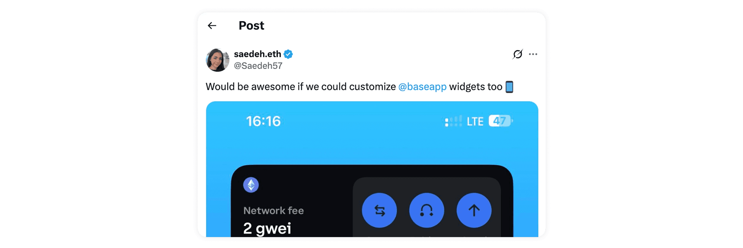
It was also a direct response to real user demand — people were already asking for widgets, showing a clear desire for simpler, lighter ways to interact with Base without opening the app.
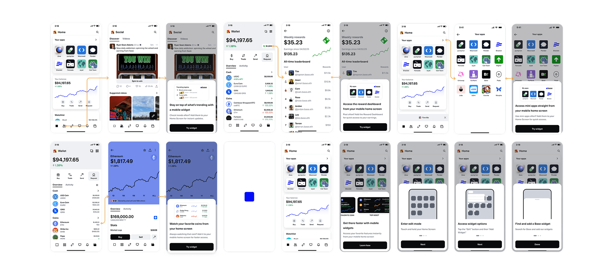
Here are the widgets we designed to meet that need — starting with the essentials and expanding into deeper engagement:
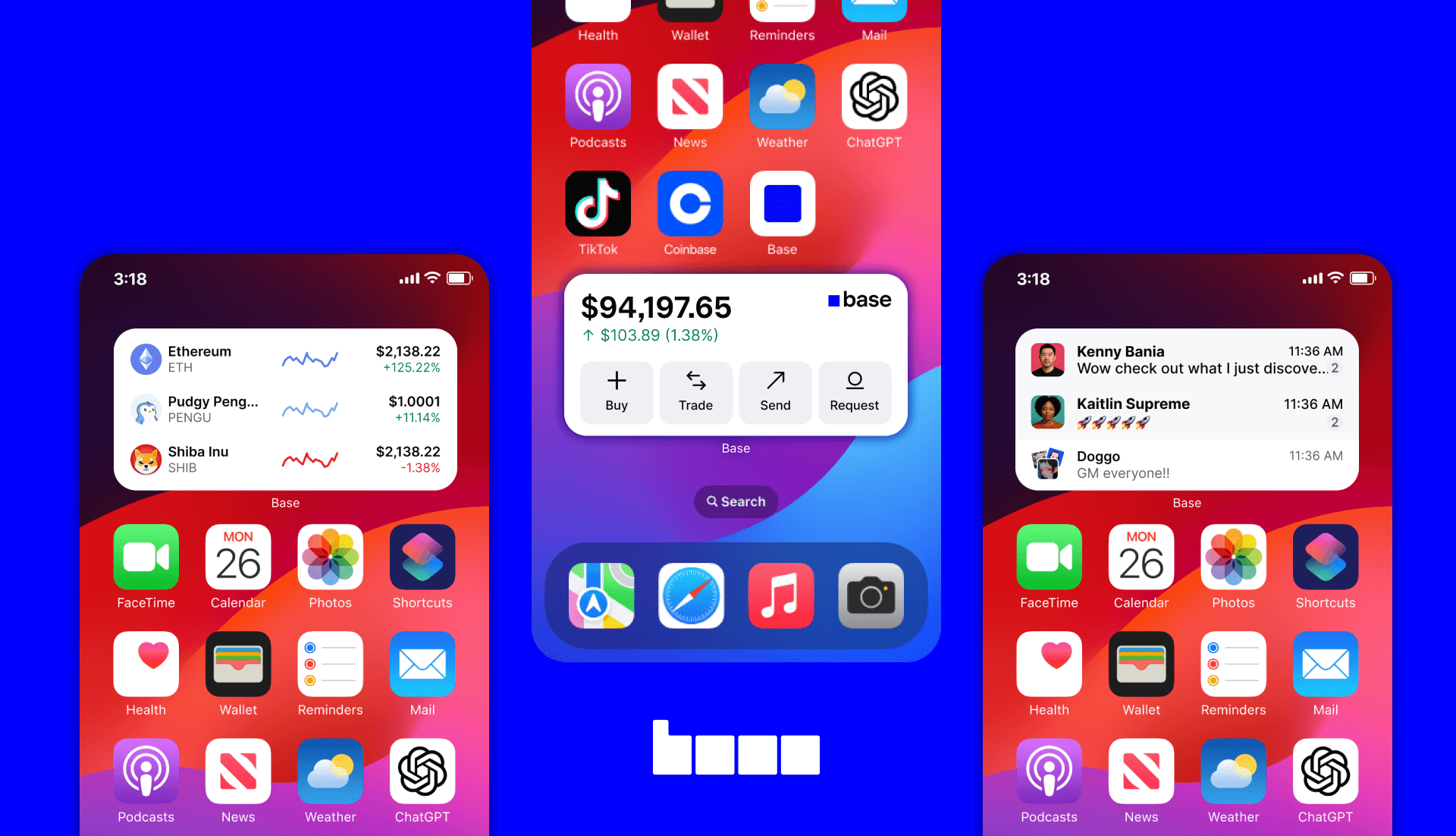
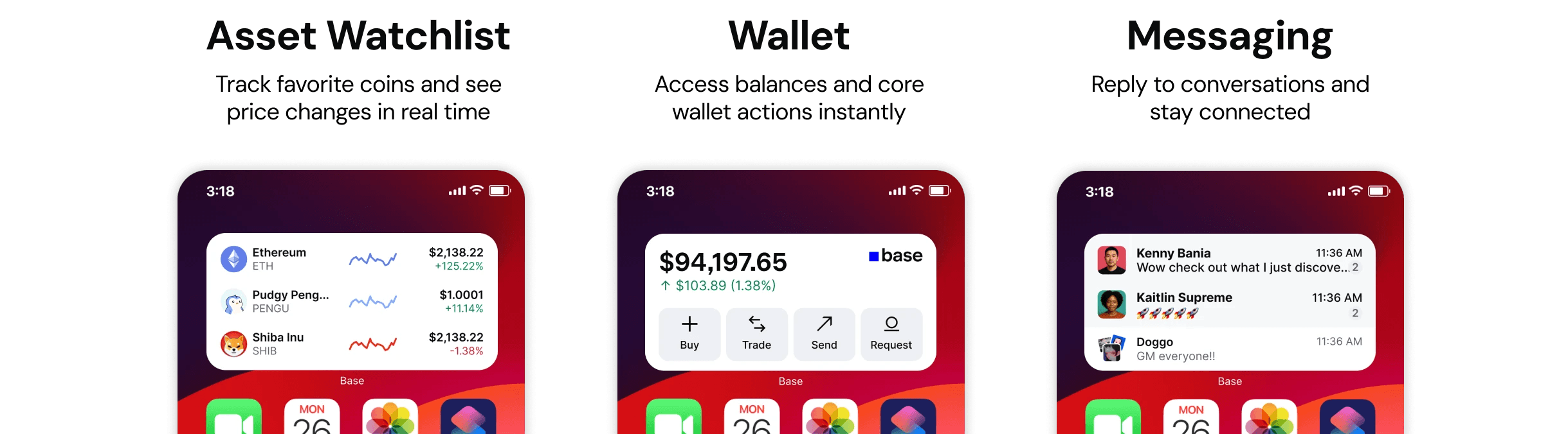
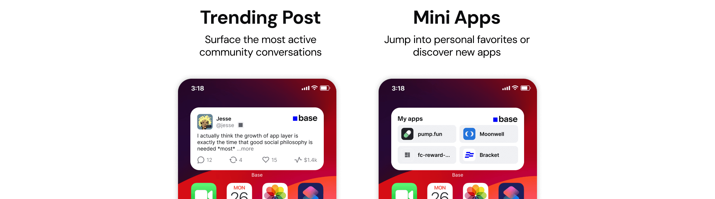
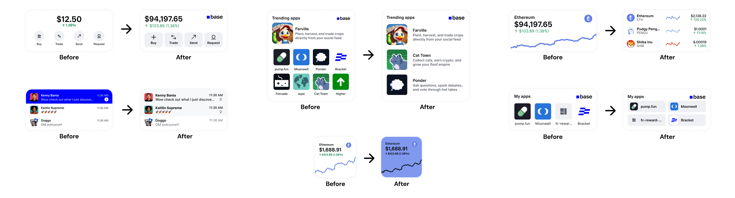
P0: Core widgets to unlock everyday value
We started by building the most essential widgets — the ones that bring Base’s core utility to the surface:
Beyond the essentials
Once the core pieces were in place, we expanded the experience with more widgets that deepen engagement:
↓ Scroll for the process!
AUDIT
Learning from the widget landscape
Before designing, I wanted to understand what already exists in the widget space. I explored how leading apps like Duolingo, Robinhood, and Apple News use widgets — looking not just at the widget experiences themselves, but also at the discovery funnels: how users learn about widgets and how they’re encouraged to add them.
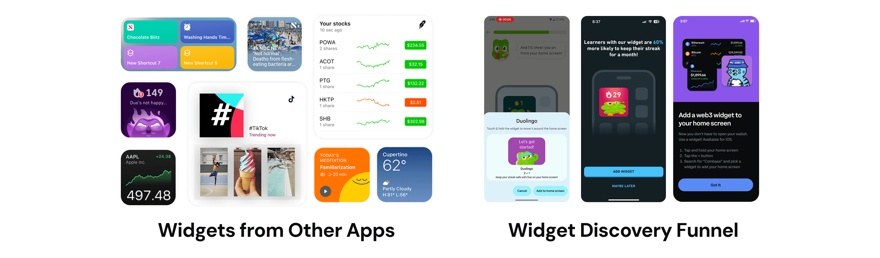
From this competitive audit, three clear patterns emerged:
🕰️ Real-Time UtilityThe best widgets provide glanceable, real-time information that users care about most, right when they need it. | ✂️ ShortcutsThey make key actions faster and more accessible by connecting users directly to core features. | 📝 Habit and EngagementOver time, they reinforce daily routines and create consistent touchpoints that keep users coming back. |
IDEATION
Exploring, mapping, and iterating the widget experience
We then kicked off with collaborative ideation sessions, where my product management partner and I explored a wide range of possibilities for how widgets could extend Base beyond the app. We sketched concepts, discussed use cases, and aligned on the core value widgets should deliver — grounding our ideas in in-app usage data, behavioral patterns, and key engagement metrics to ensure we were solving for real user needs.
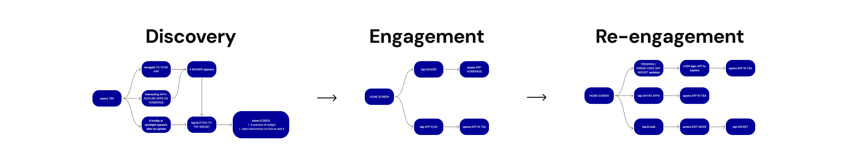
Once we had a few strong directions, I mapped the end-to-end user journey — from how someone discovers a widget, to how they interact with it day-to-day, and how we re-engage them over time. This helped us define the experience architecture before diving deeper into design.
Turning ideas Into early designs
With the journey mapped, I created multiple rounds of low- and mid-fidelity concepts, experimenting with layouts, content density, and interaction patterns. A key design challenge throughout was finding the right balance of information at a glance — enough to be useful, but never overwhelming — while staying consistent with the in-app experience.
At the same time, I was also iterating on the discovery funnel — exploring how to introduce widgets in ways that felt clear, inviting, and not too abrupt. The goal here was to make them easy to adopt and integrate naturally into users’ daily routines.
FEEDBACK
Refining through iteration and cross-functional collaboration
This project was highly collaborative. I worked closely with my product manager and engineering team to align on the vision early and ensure everything we designed was technically feasible.
Iterating through feedback from the Base App Design Team
Throughout the whole process, I also shared early concepts in our Base App design channel for async feedback and brought them into design critiques weekly for deeper discussion. These sessions led to meaningful design refinements — like improving visual hierarchy and making widgets feel more consistent with the in-app design system.
Polishing the experience with motion design and illustration
I also partnered with motion and illustration to refine the discovery funnel, adding subtle animations and visual details that made onboarding feel polished and cohesive.
FINAL SOLUTION
Bringing Base beyond the app through widgets
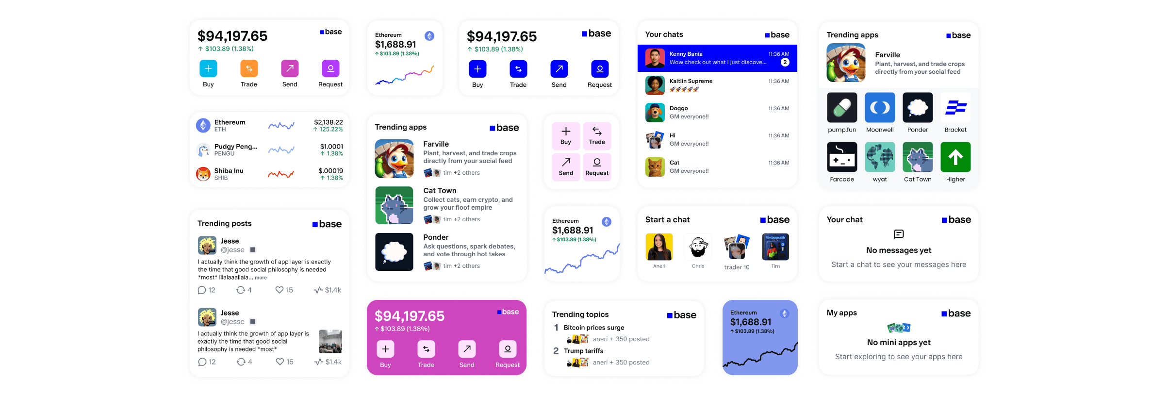
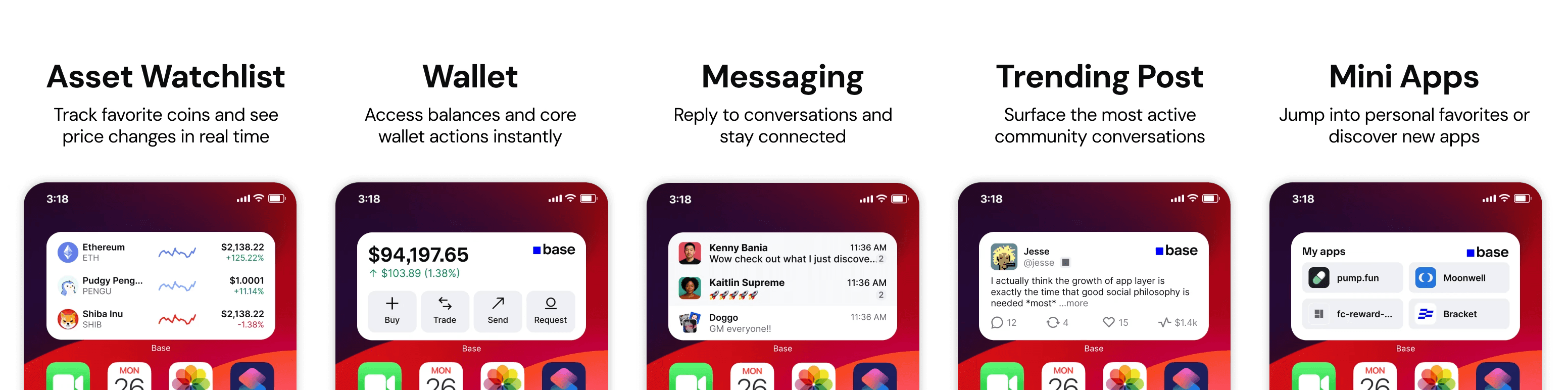
Here’s where we landed — a set of five widgets designed to make Base more accessible, useful, and woven into everyday life:
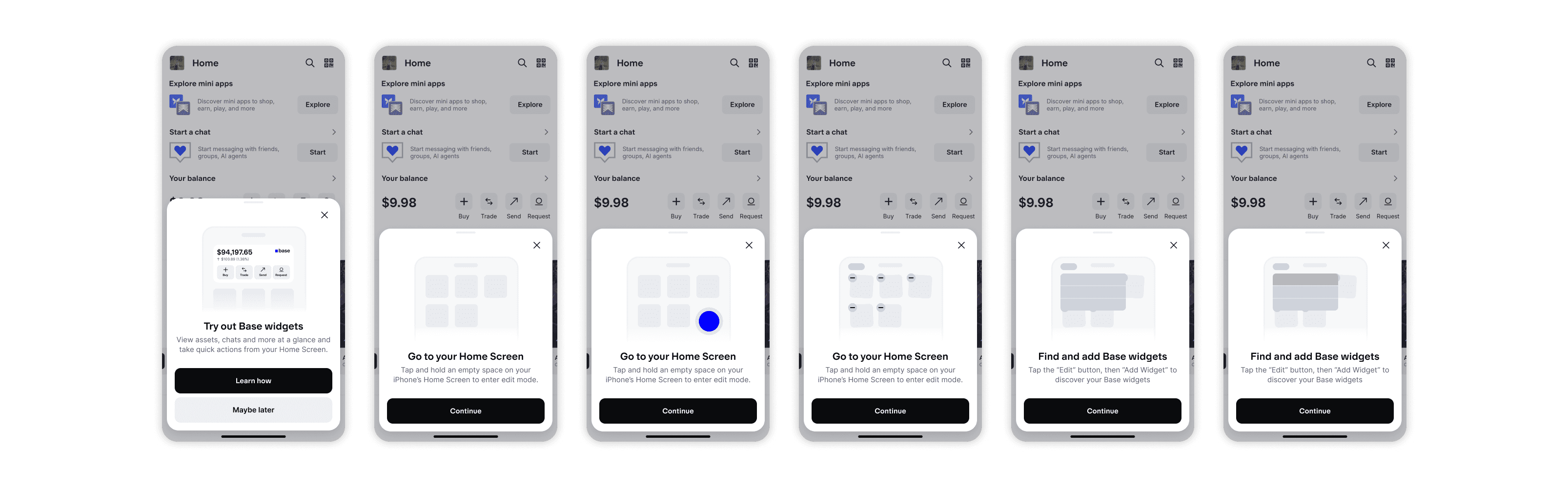
We also designed new discovery moments to make sure users know these widgets exist — from an introductory guide shown after updates to contextual prompts that surface widgets right when they’re most useful. And to reduce friction, an iOS walkthrough guides users step-by-step through adding widgets to their home screen.

REFLECTION
Lessons I learned along the way
Beyond the final designs, this project marked a real turning point in my growth as a designer. It pushed me to think more holistically — about how ideas evolve, how teams collaborate, and how products take shape. I learned to balance user needs with technical constraints and to communicate ideas clearly across disciplines.
Two key lessons stood out from this project
💡 Feedback Early, Feedback Often: One of the biggest lessons I learned was the value of sharing work before it’s “ready.” At first, putting rough ideas out there felt uncomfortable — but it made my designs stronger, built my confidence, and accelerated the process.
🔁 Iterate Often: Constant feedback naturally led to continuous iteration. Each small tweak built on the last, and over time those incremental improvements added up to a much more impactful solution.